
Seasonal inspiration
Autumn cozy coloring ideas
Rainy walks, warm kitchens and soft leaf colors make autumn an easy season for cozy pages and compact palettes.
Quick answer
Look for a dog on a leaf-covered bench, a kitchen with apples, a mushroom cottage, a rainy café, a reading nook, a pumpkin shelf or a warm cup beside a window.
The simplest recipe: one warm color for the mood, one light color to keep the page airy, a brown shadow and a small orange accent.
Use caramel, muted orange, cream, warm brown and sage. Repeat the orange and brown in small details instead of filling every object with a different fall color.
On this page
Seven easy autumn page ideas
- A cup of tea with white steam and a small biscuit.
- A window with light rain, cream curtains and warm light.
- A basket of mushrooms with leaves around it.
- A cute animal on a bench, with a blanket or scarf.
- An autumn kitchen with jam, apples and jars.
- A cozy bookshop with brown books, plants and a warm lamp.
- A page of repeating leaves if you want to color without thinking too much.
Outdoor scenes can show falling leaves, an umbrella, boots or a small animal carrying a warm drink. Indoors, try baking, jam making, shelves of pumpkins, a blanket fort or a window with visible rain.
Choose pages with one main seasonal clue rather than every autumn symbol at once. A single branch of orange leaves can set the mood while the rest of the scene stays neutral.
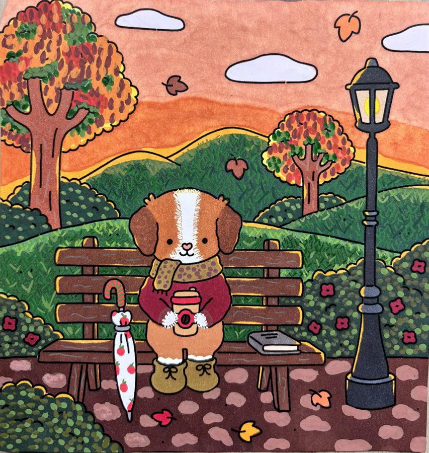
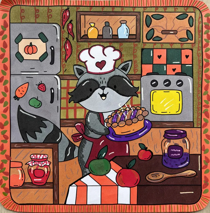
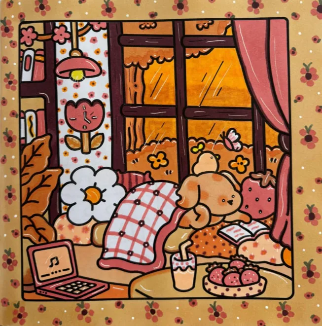
Autumn pages you can watch
These posts show autumn pages finished or in progress, with the colors going down one after another. That is easier to follow than a description when you are unsure about the order of the shades or how much orange to use.
A calm autumn palette
Use cream for large light areas, caramel as the main warmth, muted orange for seasonal accents, medium brown for structure and sage to balance the warm tones.
| Role | Color | Use it on |
|---|---|---|
| Light base | Cream, beige, sand | Cups, walls, book pages |
| Warmth | Honey, caramel, peach | Lamps, drinks, biscuits |
| Autumn | Muted orange, terracotta | Leaves, pumpkins, details |
| Shadow | Light brown, warm brown | Folds, undersides, structure |
| Balance | Sage green | Plants, clothing, a chair |
If you want deeper contrast, add a small amount of burgundy or dark olive. Keep it away from the largest surfaces so the page stays soft.
Keep the session easy
- Pick a page with few large dark areas.
- Lay down the creams and light browns first.
- Add muted orange only on leaves or small objects.
- Put a simple shadow under the cup, bench or basket.
- Finish with a few white details: steam, rain, highlights or small dots.
Start with the warm focal object—a cup, pumpkin, scarf or leaf cluster—then repeat its color twice elsewhere. Fill large background areas only after you know how dark the center of the scene feels.
A few uncolored cream areas can act like light. You do not need to cover every white space for the illustration to feel finished.
Key takeaways
- Use one clear autumn clue as the focal point.
- Balance caramel and orange with cream and sage.
- Repeat the focal color in two smaller places.
- Leave light areas to keep the scene readable.
FAQ
Which colors make a page feel autumnal?
Caramel, muted orange, warm brown, cream and sage create a recognizable but soft autumn mood.
Do I need to use bright orange?
No. A muted terracotta or peach can suggest autumn while keeping the page calm.
What is an easy autumn subject for beginners?
A warm drink, a few leaves or a simple indoor baking scene gives you clear seasonal cues without too many tiny details.
How do I keep leaves from looking flat?
Use two close tones on the same leaf and leave a lighter area near the vein. Vary the colors slightly from one leaf to the next instead of making them all identical.
How many colors for an autumn page?
Four to six is enough: a light base, one dominant warm color, an orange accent, a brown shadow and optionally a green to balance it.