
Ready-to-use palette
An autumn palette for cozy coloring
Five balanced colors can make an autumn page feel warm without becoming too orange or too dark.
Quick answer
Use cream, caramel, muted orange, warm medium brown and sage green. Let cream and caramel cover most of the page, then reserve orange, brown and sage for smaller repeated areas.
If your marker set has no exact match, choose colors with similar softness and value rather than chasing a specific name or code.
On this page
An autumn page colored with this palette
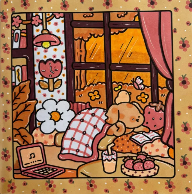
This is what the five colors look like on a finished page: cream on the walls and blanket, caramel on the wood, orange kept for the leaves and a few details. The posts below show the markers side by side, which helps you spot the ones that look too similar.
The five-color autumn palette
Cozy autumn
For leaves, cups, jams, jumpers, benches and rainy scenes.
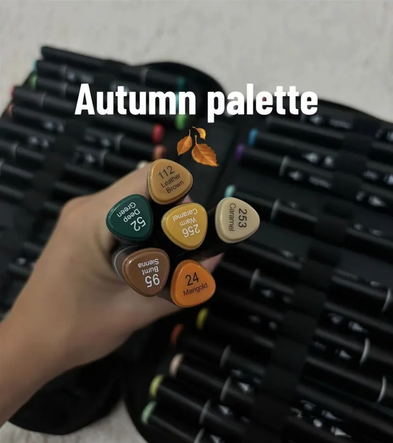
Cream provides light and breathing room. Caramel is the main warm color. Muted orange signals the season. Warm brown anchors furniture, fur or outlines. Sage adds a cool natural counterweight.
Test the five swatches in a row. The orange should not overwhelm the caramel, and the brown should be clearly darker than both. If two colors look almost identical, replace one with a lighter or darker option.
Where to place each color
| Color | Best for | Watch out |
|---|---|---|
| Cream | Background, cups, walls, book pages | Do not fill everything: leave some white too. |
| Caramel | Warm drinks, lamps, wood, baskets | Keep it lighter than your shadow brown. |
| Muted orange | Leaves, pumpkins, small details | Use it on small areas only. |
| Warm brown | Shadows, structure, outlines | Avoid pure black next to it. |
| Sage green | Plants, clothing, a chair | Repeat it twice so it does not look isolated. |
Use cream on walls, paper, ceramics or light fabric. Put caramel on wood, baskets and the main accessory. Reserve orange for leaves, fruit and two or three decorative details.
Brown works on the deepest structural shapes and sage on plants, clothing or a chair. Repeating sage in two places stops the warm colors from blending into one block.
See the palette as a group
Keep your selected markers beside the page from start to finish. That visible limit makes it easier to reuse a color instead of searching for a new one whenever you meet another object.
You can create more variety by leaving white space or using a second pass only in small shadow areas.
Key takeaways
- Base the page on cream and caramel.
- Use muted orange as a repeated seasonal accent.
- Anchor small areas with warm brown.
- Add sage to balance the warm palette.
FAQ
What are the five colors in this autumn palette?
Cream, caramel, muted orange, warm medium brown and sage green.
Which color should I use most?
Cream and caramel can cover the largest areas, while orange works best as a smaller accent.
Can I add a sixth color?
Yes. Burgundy or dark olive can add contrast, but use it sparingly so the page stays soft.
Does this palette work with water-based markers?
Yes, as long as you keep the layers light. Water-based markers saturate quickly, so two thin passes work better than one heavy pass.
What if my orange looks too bright?
Go over it with a little caramel or light brown while the area is still fresh, or keep the orange for smaller surfaces.