
Ready-to-use palette
A pastel palette for cozy coloring
Dusty pink, pale blue, cream, sage and lavender create a gentle page that is easy to repeat and hard to overload.
Quick answer
Use cream for the lightest large areas, choose either dusty pink or pale blue as the main color, then repeat sage and lavender in smaller objects. Add one slightly darker neutral only when the page needs more depth.
Pastel does not have to mean low contrast everywhere. A few medium-value edges keep furniture, animals and focal objects readable.
On this page
A pastel page colored with Ohuhu markers
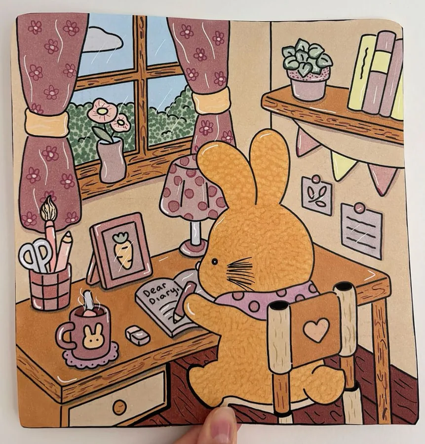
This page was colored with an Ohuhu pastel alcohol marker set. It is a useful reference for how these shades look once dry, which is often different from the cap preview. If you are unsure about the set, the full Ohuhu markers review covers the tips, the paper and the limits.
The five-color pastel palette
Cozy pastel
For cute animals, bedrooms, cups, notebooks, simple flowers and small props.
Dusty pink adds warmth, pale blue adds coolness, cream connects both, sage introduces a natural tone and lavender works as a soft accent. Choose muted versions rather than fluorescent or very saturated markers.
Swatch the set together and photograph it if you want to reuse it. A palette becomes more useful when you can return to it without rebuilding the combination each time.
Pages that suit these colors
- A cute animal with props: a cup, a cushion, a small bag.
- A cozy bedroom with a blanket, a lamp and a bookshelf.
- Simple flowers on a very light background.
- A bubble bath page with soft blue and light pink.
- A desk scene with notebooks, pens and a warm drink.
Pastels work well on bedrooms, cafés, little shops, cute animals, bookshelves, bathrooms and spring scenes. They are especially helpful when an illustration already contains many small objects because the short palette unifies them.
Choose one of the cooler colors for windows and distant areas, then bring the warmer pink or cream toward the main character.
Use pastels with your marker type
With alcohol markers, test how pale shades dry and keep a protective sheet under the page. With water-based markers, use small shapes and avoid repeated passes that may roughen the paper.
A white acrylic marker can add tiny highlights after the page is dry, but the palette should still work without it. Use details as a finish, not as a way to rescue every area.
The Ohuhu pastel marker set I use
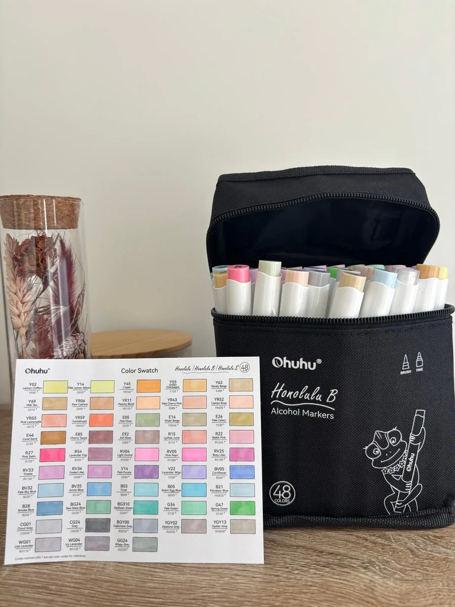
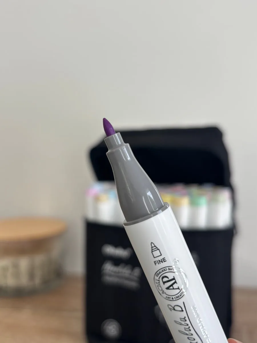
I bought the Ohuhu Honolulu B 48 pastel color set to have soft pinks, pale blues, greens, purples and neutral shades that are easy to combine. The reference includes 48 pastel colors and a colorless blender. The version shown in my photos has a brush tip and a fine tip.
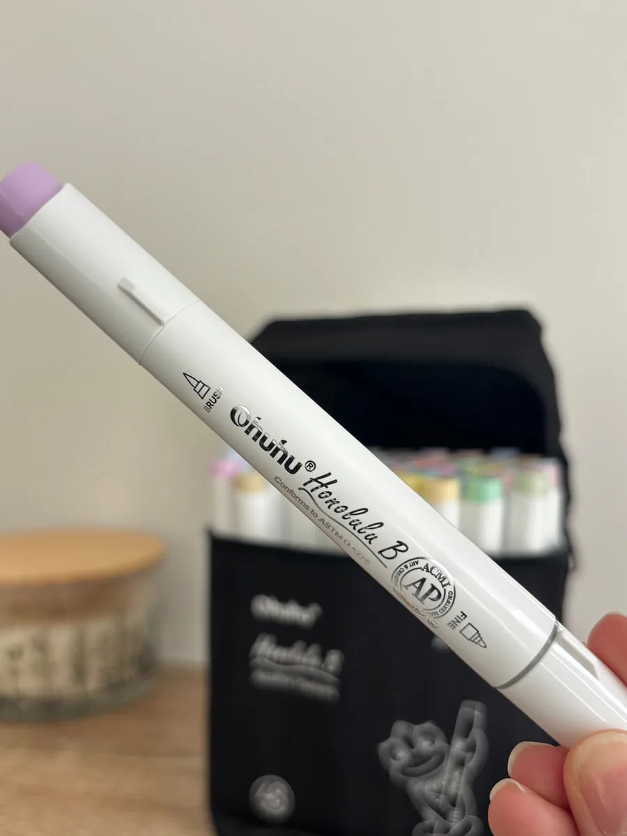
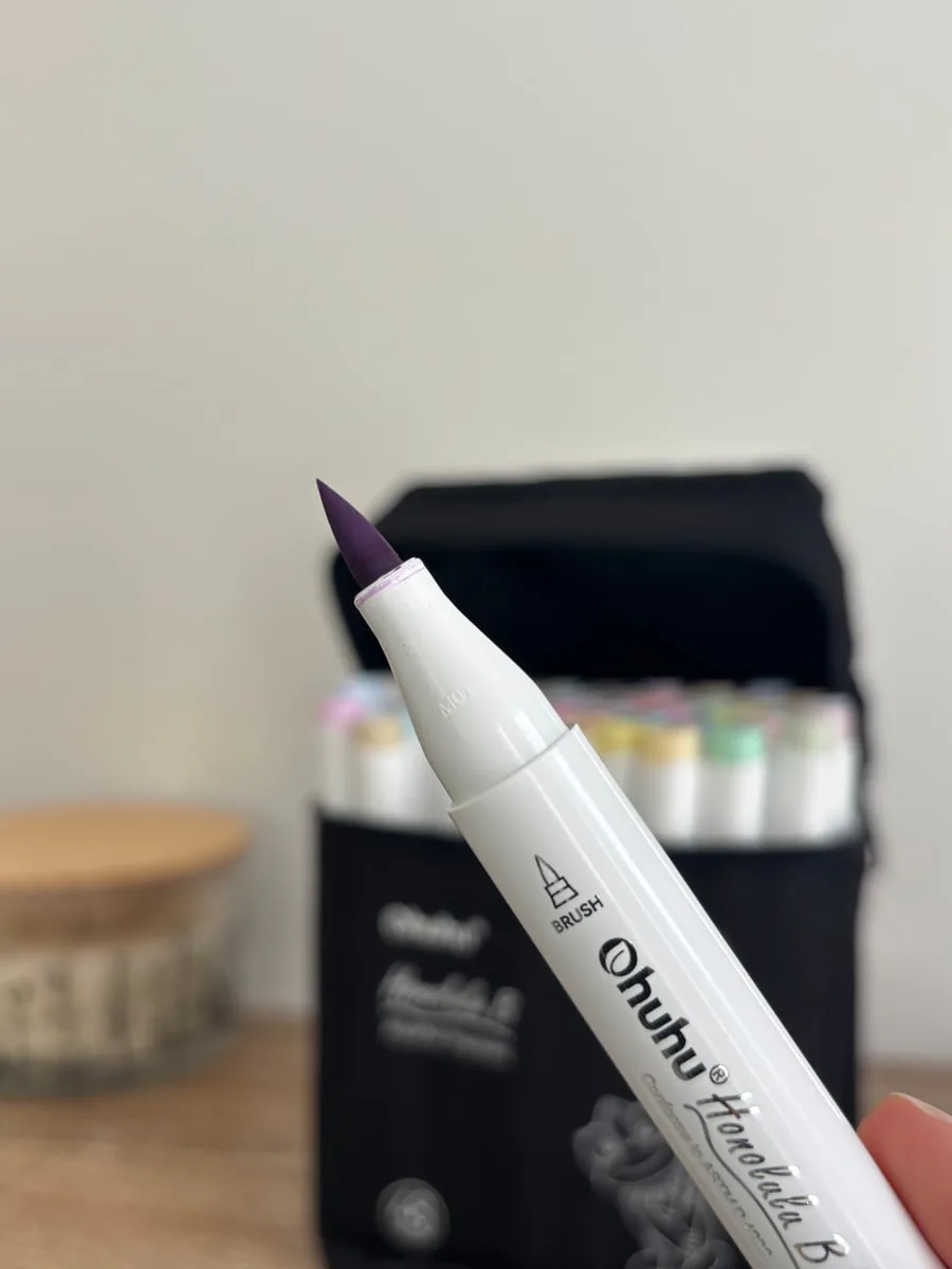
- The brush tip works well for filled areas, petals and rounded shapes where the stroke needs to remain flexible.
- The fine tip is useful for small accessories, narrow patterns and details close to the outlines.
- The completed swatch chart is more reliable than the caps when choosing a palette before starting the page.
I do not try to use all 48 colors in one illustration. I usually select five to seven shades: one main color, one or two neighboring shades, a neutral for shadows and one small accent color. This limit keeps the pastel result readable. You can see the same value-based approach in the four-step alcohol marker tutorial.
Key takeaways
- Combine dusty pink, pale blue, cream, sage and lavender.
- Choose one pastel as the main color.
- Keep a little medium-value contrast for readability.
- Adapt your layering to the paper and marker type.
FAQ
Which five colors make an easy pastel palette?
Dusty pink, pale blue, cream, sage green and lavender are balanced and easy to repeat.
Why does my pastel page look flat?
Add a few medium-value edges or a slightly darker neutral around the focal object instead of darkening every area.
Can beginners use pastel alcohol markers?
Yes. Light alcohol markers are forgiving, but always test the dry color and protect the sheet underneath.
Which pastel marker set should I choose?
A dedicated pastel set saves you from lightening bright colors yourself. The Ohuhu pastel set used in the example above already gives softened shades.
Can I mix pastel and bright colors?
Yes, but keep the bright color on very small areas. As soon as a saturated color covers a large surface, the page stops reading as pastel.