
Seasonal inspiration
Winter cozy coloring ideas
The easiest winter pages combine a cool view outside with a warm, simple focal point indoors.
Quick answer
Choose a fireplace, hot chocolate, thick socks, candles, a snowy window, a reading chair or a small animal under a blanket. Use one warm accent against pale blue, cream and soft gray.
You do not need to color snow blue everywhere. White paper, a very light cool shadow and a darker window frame can already make it read as snow.
On this page
Winter pages that are easy to start
Blanket and hot chocolate
Color the blanket with two colors only, then add a shadow under the cup. The chocolate can stay light brown, with a small cream highlight.
Window with snow
Keep the snow very light: blue gray, pale lavender or almost white. The warmth comes from inside instead: a lamp, a cup, a curtain, a book.
Candles and a reading corner
Candles are perfect for a simple page. A honey flame, a small yellow area around it, then a light brown under the objects quickly creates depth.
Fireplace
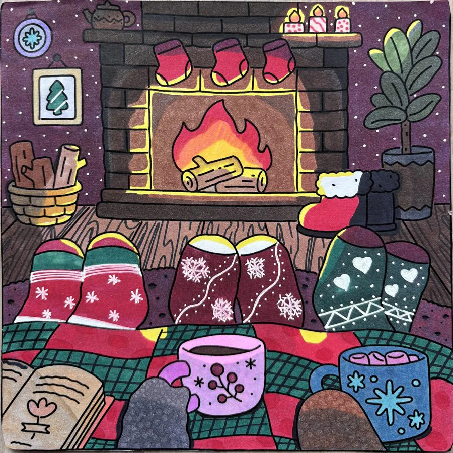
A fireplace immediately sets a cozy winter mood. Keep the flames in honey and muted orange, then add warm brown around the socks, the blanket and the drinks.
Look for one large indoor object such as a fireplace, bed, armchair or kitchen table. Add a seasonal clue through the window or in a small prop: snow, mittens, a mug, string lights or a folded scarf.
A clear inside-versus-outside contrast gives the page structure. Keep the outside pale and cool, then place the strongest warm color near the main character.
An easy winter palette
| Mood | Colors | Tip |
|---|---|---|
| Bright snow | Blue gray, pale lavender, cream | Leave plenty of white visible. |
| Warm interior | Cream, honey, light brown | Keep the warmest tone near the focal point. |
| Festive | Muted red, dark green, gold | Use red on small areas only. |
| Everyday winter | Dusty pink, cocoa brown, sage | Softer than red and navy, less seasonal. |
Combine pale blue, cream, soft gray, muted red and dark navy. The blue and gray describe the cold light; cream prevents the interior from feeling stark; muted red creates warmth; navy adds structure.
For a softer alternative, replace red with dusty pink and navy with cocoa brown. The scene will feel less festive and more like an everyday winter afternoon.
Make the interior feel warmer
Place cream or pale yellow close to light sources, then use a slightly darker warm tone on nearby objects. A dark edge beneath a blanket or shelf makes the light area look brighter without complicated blending.
Repeat soft textures with simple patterns: dots on a mug, stripes on socks or a checked blanket. Two or three repeated details are enough.
A winter scene on video
A small bear reading by the fire: exactly the kind of scene described above, with a warm interior and an outside left cold. The video shows the finished result once all the colors are down.
Key takeaways
- Contrast a cool exterior with one warm indoor focal point.
- Let white paper represent most of the snow.
- Use pale blue, cream, gray, muted red and navy.
- Add only a few simple textile patterns.
FAQ
How should I color snow?
Leave most of it white and add very light blue or gray only where shadows would appear.
Which warm accent works best in winter scenes?
Muted red, dusty pink, caramel or a soft golden yellow can all create a warm focal point.
How do I make a room look cozy?
Use a warm light color near the focal point, add one darker structural tone and repeat a simple textile pattern.
Should I color the winter sky?
Not necessarily. A sky left white or barely tinted with gray reinforces the cold feeling and puts the interior forward.
How do I get a firelight effect?
Build a soft yellow or orange gradient starting from the fire, and keep the far areas cooler. The contrast does all the work.